


In the digital age, attention is a precious commodity. With countless websites, apps, and social media feeds fighting for our precious milliseconds, capturing even a fleeting glance with display ads feels like an uphill battle. But fear not, marketers! By harnessing the power of good design, you can not only cut through the noise but also craft display ads that convert. These ads won’t just stand out, they’ll stop the scroll, ignite curiosity, and ultimately drive users to click that coveted CTA button.
But how do you design eye-catching, click-worthy display ads in a landscape where banner blindness reigns supreme? Here are 5 essential design principles for display ads, supported by data and real-world examples:
1. Structure: The Backbone of a Compelling Message
Think of your display ad as a mini-stage where your marketing message takes center stage. The layout – the arrangement of key elements – is what directs the audience’s gaze and guides them towards your desired action.
Data Says: A study by Nielsen Norman Group found that ads with clear hierarchical structures (where headings, body text, and CTAs are visually prioritized) saw 23% higher click-through rates compared to cluttered designs.
Mastering the Art of Structure:
Focus on the essentials: Your ad should have four main players – your brand identity (logo or name), a value proposition (what you offer), a relevant image, and a clear call to action (CTA).
The Rule of Thirds is your friend: Divide your ad space into thirds, both horizontally and vertically. Place key elements like your CTA and value proposition in these “power points” for maximum impact.
White space is your ally: Don’t overload your ad with information. Utilize negative space to create breathing room and prevent information overload.
Example: Look at Spotify’s display ad showcasing their “Your Daily Drive” mixtape feature. The clean layout with a prominent logo, bold headline, and contrasting CTA button instantly conveys the value proposition, making it difficult to miss.
2. Color Palette: Evoking Emotions and Branding
Colors are visual magnets, instantly influencing emotions and perceptions. Choosing the right palette for your display ad can make all the difference in grabbing attention and aligning with your brand identity.
Data Speaks: According to Kissmetrics, using contrasting colors can increase brand recognition by 80%.
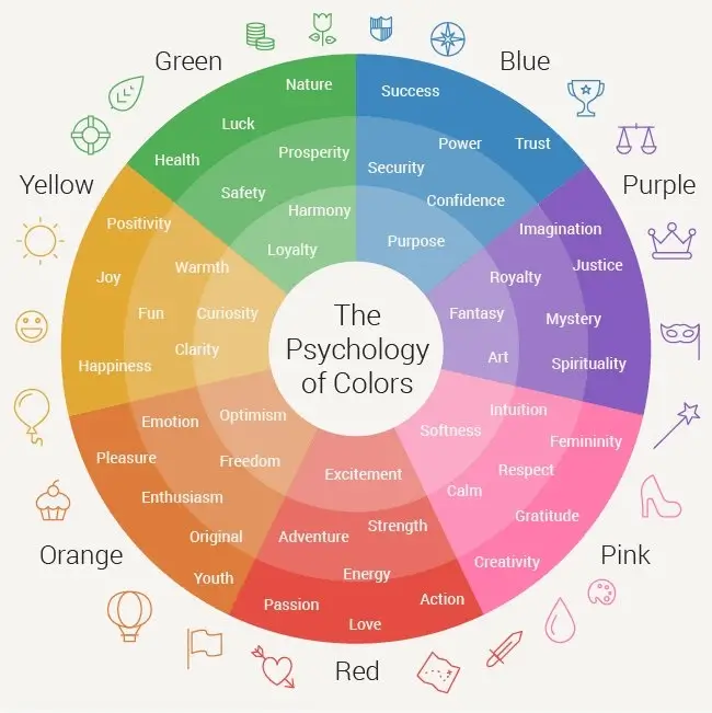
Color Psychology in Action:
Warm colors like red and orange exude energy and excitement, perfect for promoting action-oriented offers or time-sensitive deals.
Cool colors like blue and green inspire trust and calmness, well-suited for promoting financial services or healthcare products.
Consider brand consistency: Align your color palette with your existing brand colors to create a sense of familiarity and reinforce brand awareness.
Example: Take a cue from Dropbox’s display ad. Their signature blue hue instantly evokes their brand identity, while the contrasting pink CTA button pops off the screen, urging users to “Try Dropbox Free.”
3. Typography: The Voice of Your Ad
The fonts you choose are more than just visual aesthetics; they’re the voice of your ad, whispering your message into the viewer’s mind.
Data Whispers: Studies show that using readable fonts can increase ad engagement by 38%.
Choosing the Right Typeface:
Clarity is king: Opt for easy-to-read fonts, especially on smaller display formats. Sans-serif fonts like Arial or Helvetica are generally safe bets.
Match the mood: Play with font weights and styles to convey the desired tone. Bold, playful fonts are great for lighthearted campaigns, while elegant, serif fonts lend an air of sophistication.
Hierarchy matters: Use different font sizes and weights to establish visual hierarchy, prioritizing headlines and CTAs for maximum impact.
Example: Masterclass’s display ad for “Gordon Ramsay Teaches Cooking” perfectly demonstrates the power of typography. The bold, handwritten-style headline immediately grabs attention, while the contrasting subheading in a smaller, serif font provides additional details without feeling cluttered.
[12 Social Media Experts Offer Their Predictions For 2024]
4. Visuals: Show, Don’t Tell, and Captivate
Keep it relevant: The image should directly connect to your value proposition and brand message. Don’t use generic visuals that could apply to any campaign.
Embrace emotion: Use visuals that evoke positive emotions associated with your brand or offer. Happiness, humor, and surprise can be powerful attention-grabbers.
Think mobile-first: Optimize your visuals for mobile devices, where most display ad impressions occur. Use vertical compositions and ensure elements are large enough for easy viewing on smaller screens.
Example: Take a look at Nike’s display ad for their Air Zoom Pegasus running shoes. The dynamic image featuring a runner in action instantly conveys the product’s purpose and benefits, while the contrasting black background makes the vibrant shoe pop off the screen.
5. The CTA: Compelling the Click
Your call to action is the bridge between your captivating ad and a potential conversion. Make it clear, concise, and irresistible.
Data Counts: Hubspot reports that adding a CTA button can increase click-through rates by 47%.

Crafting the Perfect CTA:
Action verbs matter: Use strong verbs like “Shop Now,” “Download Now,” or “Get Started” to encourage immediate action.
Color contrast is key: Choose a CTA button color that stands out from the rest of your ad design, attracting attention and inviting clicks.
Keep it concise: Short, clear CTAs are more effective than long, winded ones. Aim for two to three words that summarize the desired action.
Test and refine: A/B test different CTA button styles and wording to see what resonates best with your audience.
Example: Look at Airbnb’s display ad showcasing their “Host with Airbnb” program. The bold orange “Become a Host” button contrasts beautifully with the blue background, instantly grabbing attention and prompting users to consider hosting their own property.
[Mastering PPC Trends in 2024: A Comprehensive Guide]
Beyond the Principles: A Final Note
Mastering these design principles for display ads is a great starting point, but remember, display ad creation is an ongoing experiment. Continuously track your results, analyze user behavior, and be ready to adapt and refine your designs based on real-time data. With a data-driven approach and a commitment to captivating design, you can craft display ads that not only stand out but also drive clicks and conversions, turning fleeting glances into loyal customers.
Additionally, remember:
Accessibility matters: Ensure your ad designs are accessible to users with visual impairments by using alt text and appropriate color contrast.
Stay on brand: Don’t compromise your brand voice or identity in the pursuit of attention-grabbing visuals.
Tell a story: Use visuals and copy to tell a compelling story that connects with your audience on an emotional level.
By following these design principles for display ads and remaining adaptable, you can create display ads that break through the noise, capture imaginations, and ultimately move your audience to action. So, go forth and design!
